BAKED
BAKED
BAKED
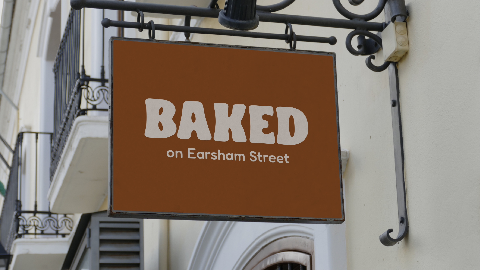
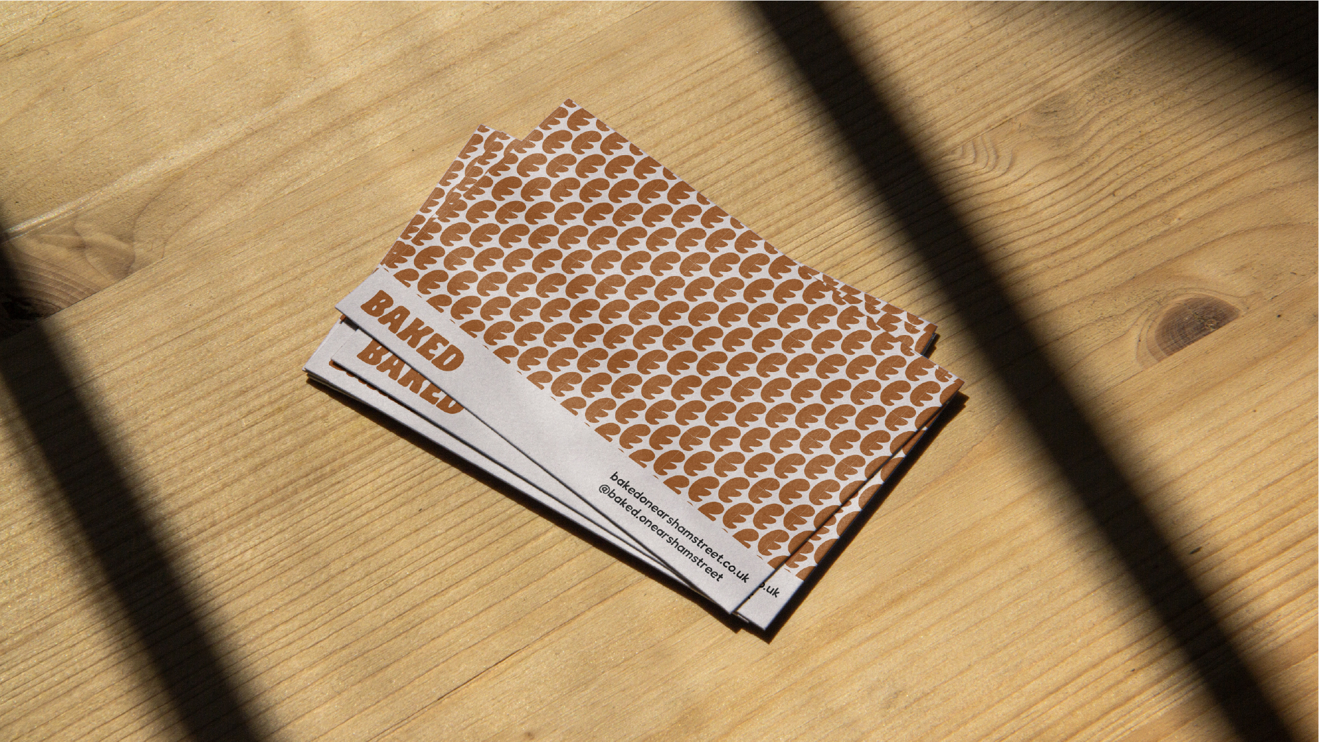
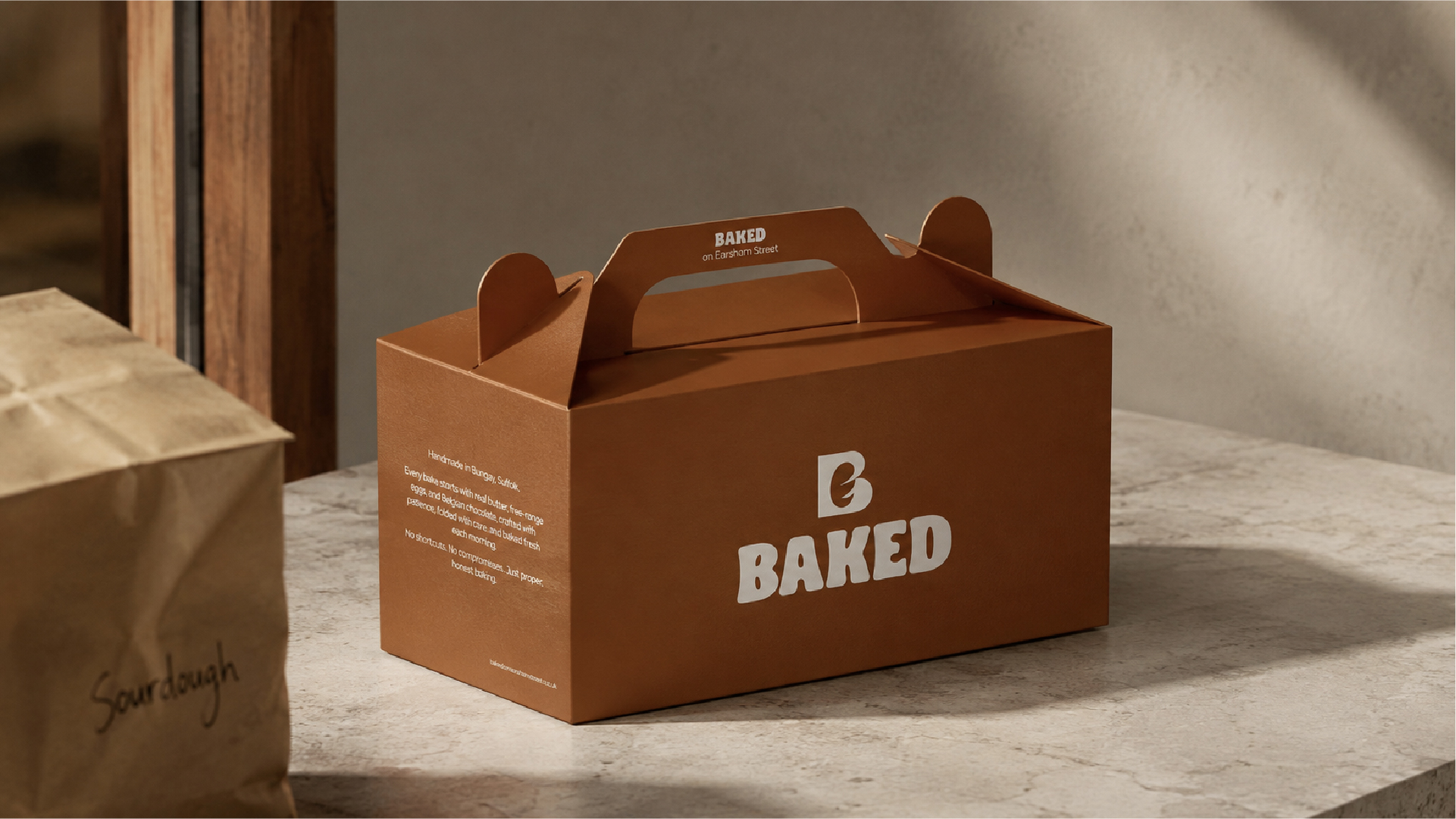
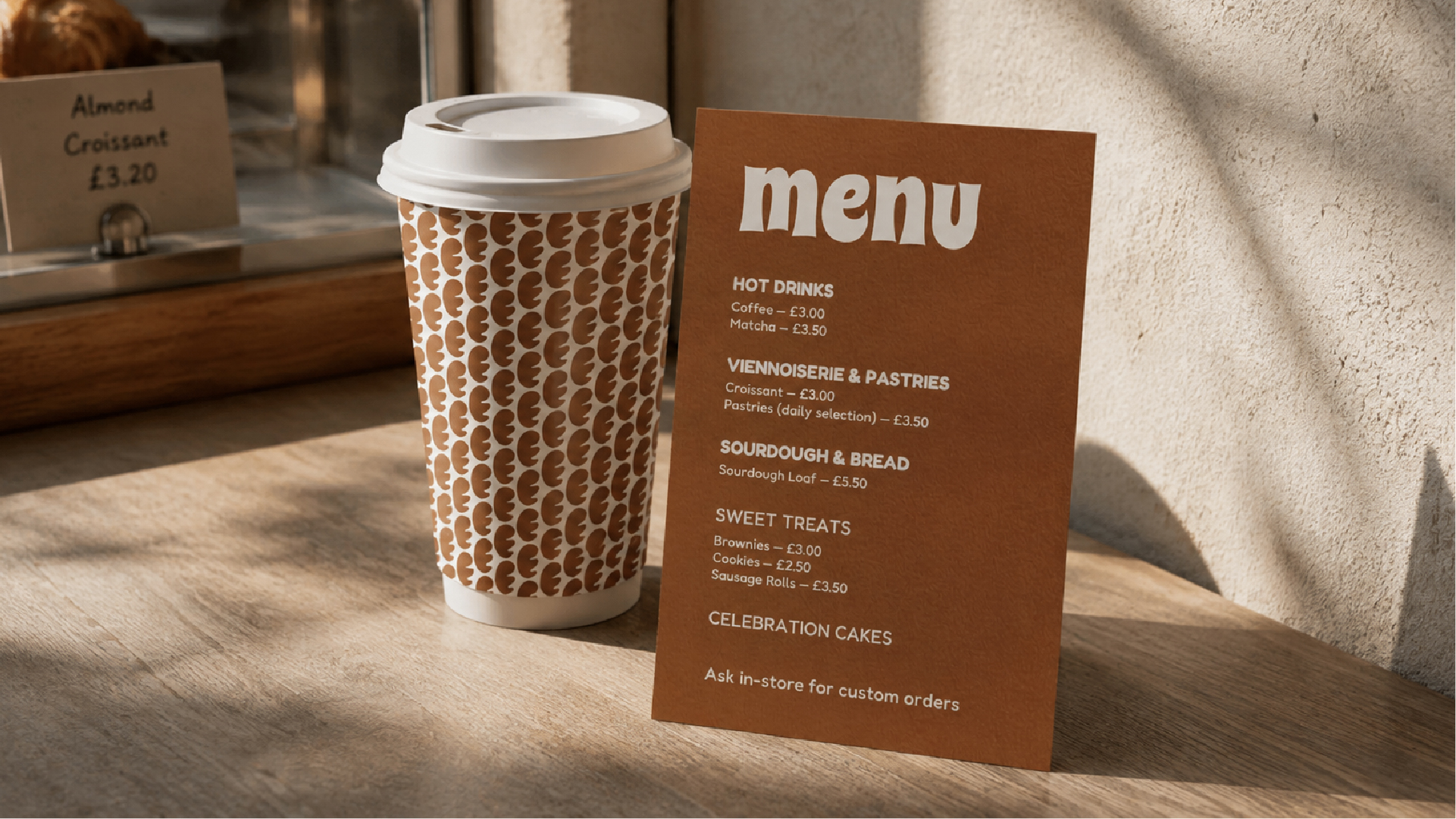
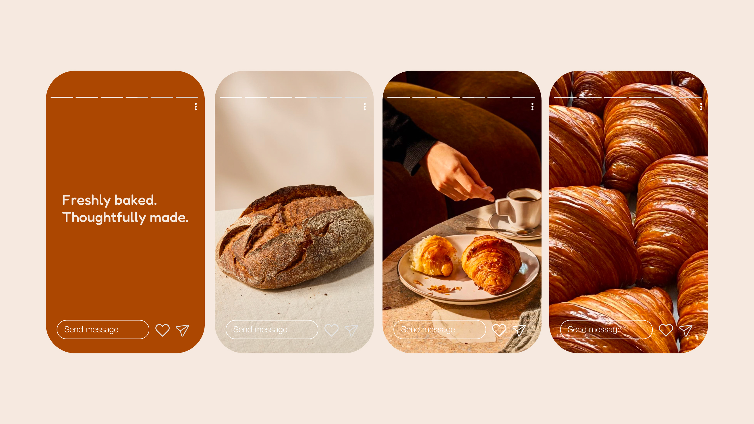
BAKED on Earsham Street had earned real community trust in just four months — daily queues, a loyal following, genuine word-of-mouth. But their identity had not caught up. We built a complete brand system: a distinctive mark, a warm and confident visual language, and full application across packaging, signage, and social — so the shop finally looks like what it already is.
Problem
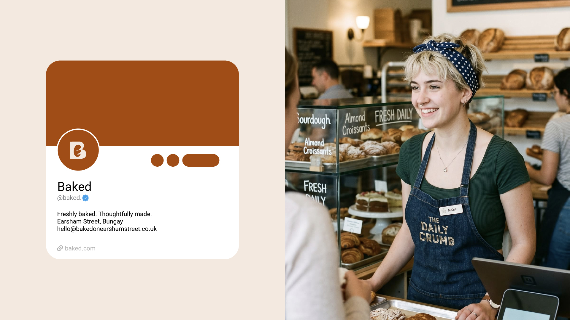
BAKED. on Earsham Street had built genuine community trust in four months, but its identity had not caught up. The website used an elegant serif wordmark while Instagram used a separate illustrated storefront, leaving the brand fragmented and difficult to own as the business grew.
Research
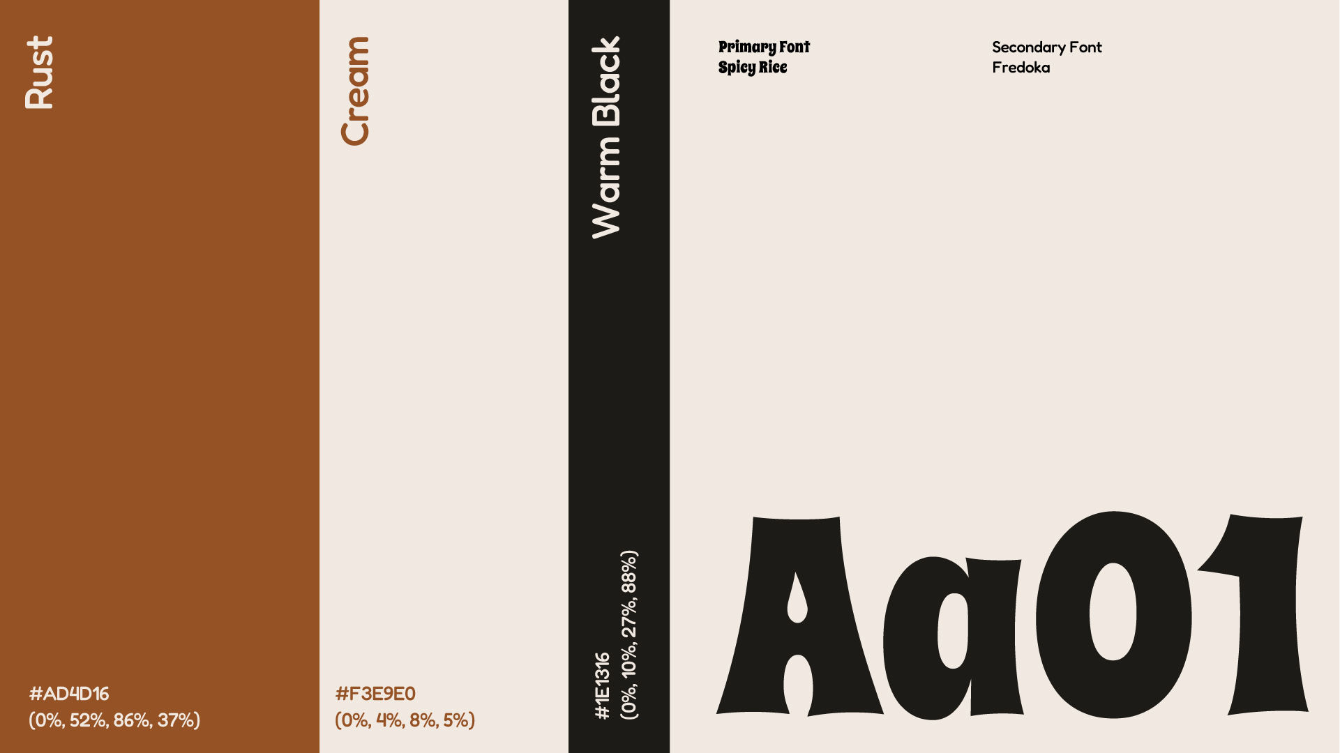
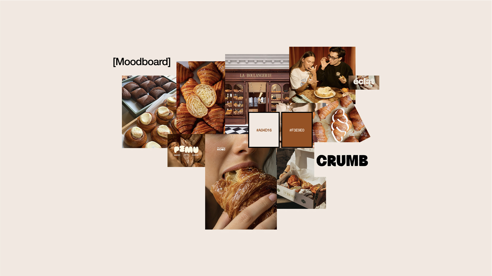
We studied the independent bakery category and found two familiar lanes: whimsical illustration or refined restraint. We also looked at BAKED.’s own products, using warm crust, chocolate, and roasted tones already present in the bread as the most honest starting point.
Exploration
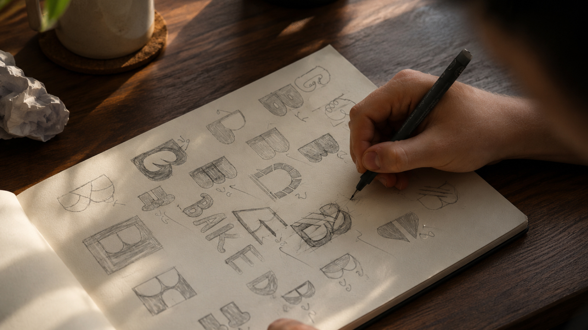
We generated more than 50 concepts by hand, exploring monograms, crumb shapes, doorway motifs, and score-cut marks. Three routes reached the shortlist before the team chose to move from refined minimalism toward a bolder, warmer, more playful wordmark-led direction.
Decision
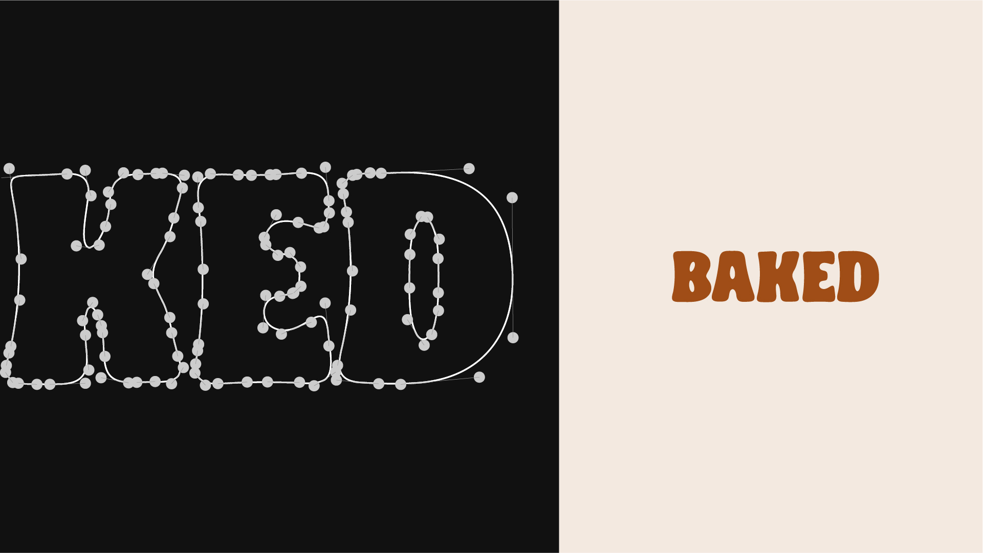
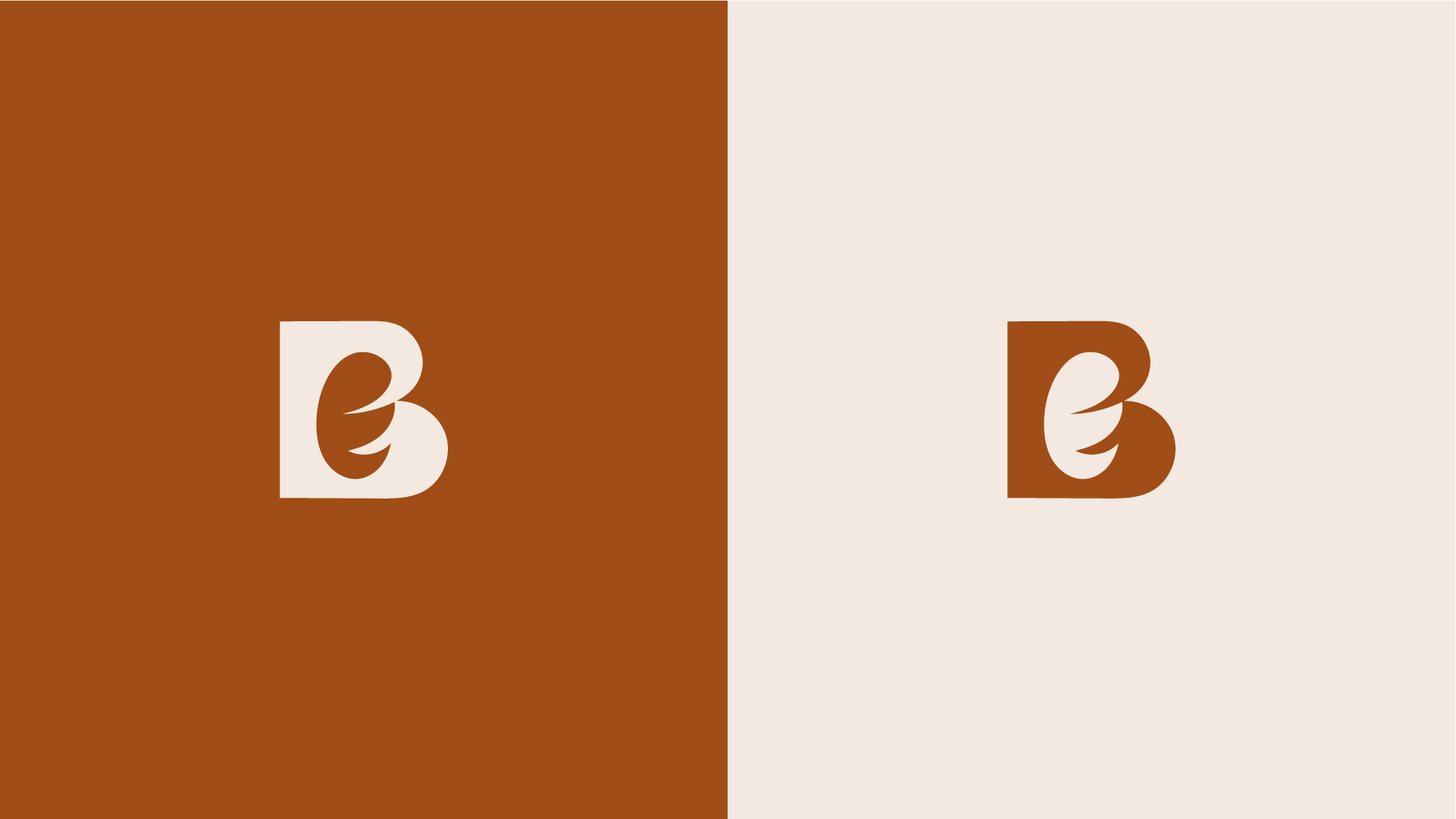
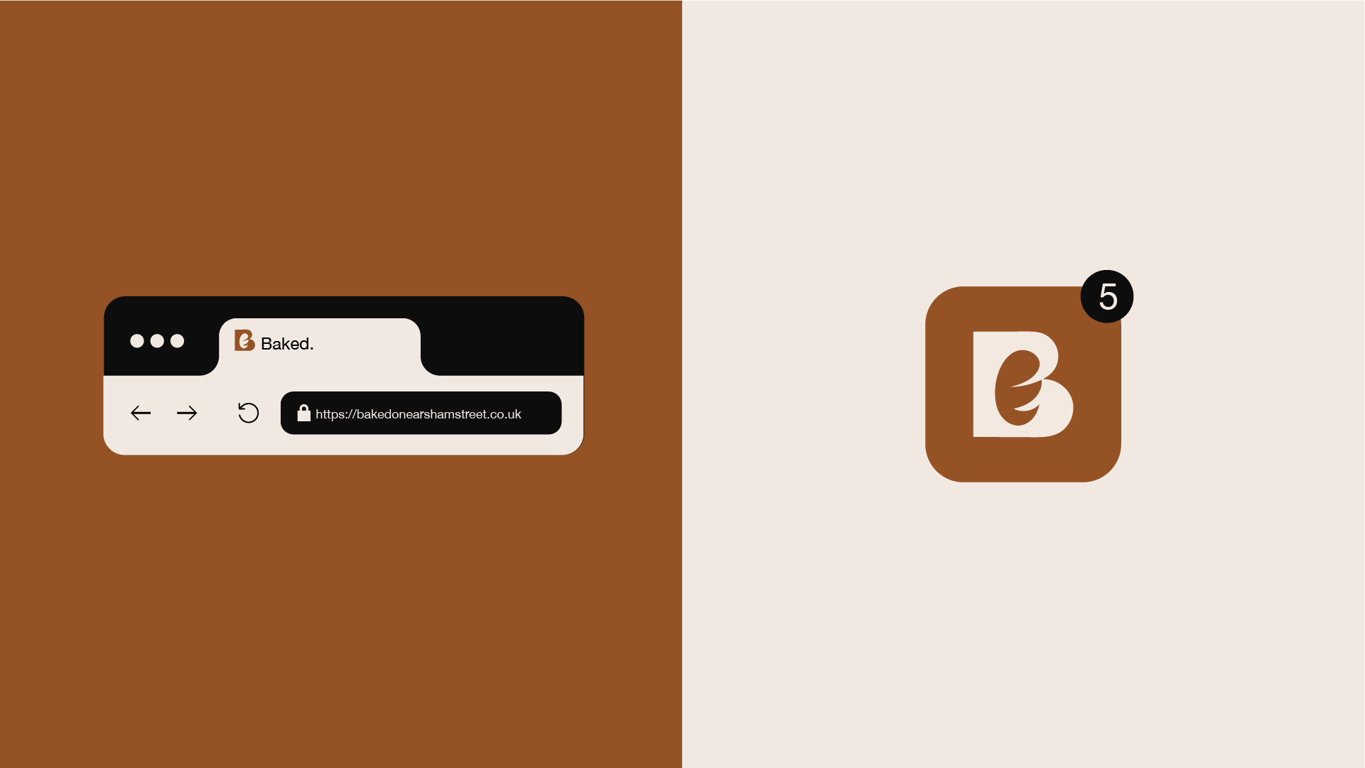
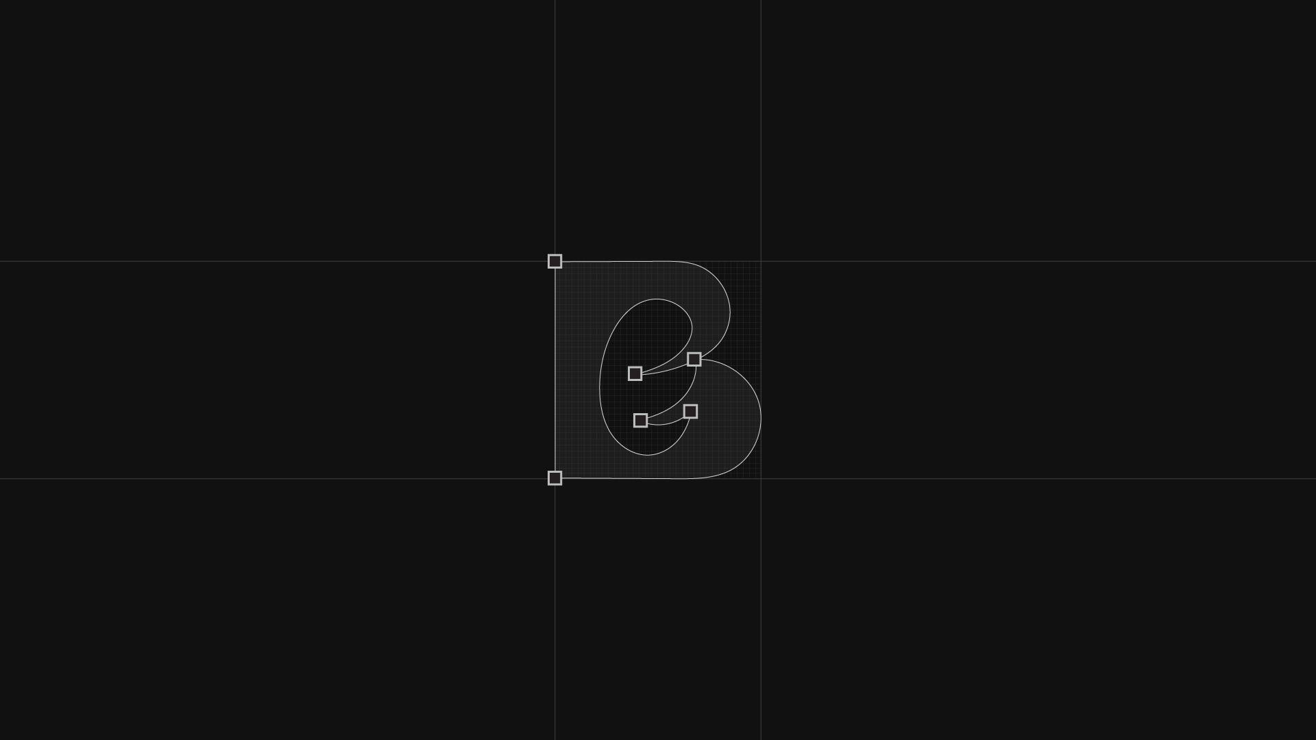
The final identity pairs a bold, wavy-baseline BAKED wordmark with a rounded B mark and soft internal swirl. It is confident, handmade in spirit, and flexible across seals, favicons, packaging details, and the wider bakery experience.